The Plotly-Shiny client has been updated with the 2.0 R client release. Read the new Plotly-Shiny client tutorial.
Shiny is an R package that allows users to build interactive web applications easily in R! Using Shiny and Plotly together, you can deploy an interactive dashboard. That means your team can create graphs in Shiny, then export and share them.
Shiny apps involve two main components: a ui (user interface) script and a server script. The user interface script controls the layout of the app and the server script controls what the app does. In other words, the ui script creates what the user sees and controls and the server script completes calculations and creates the plots.
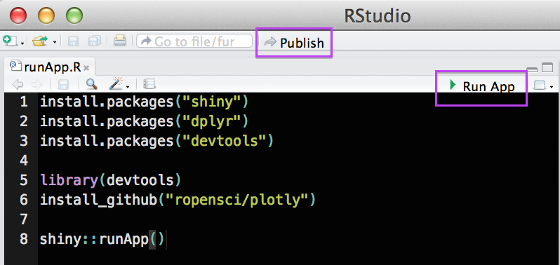
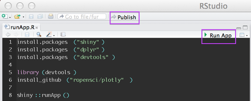
To make a shiny app that is a plotly widget, just add 3 scripts to your app folder in addition to the ui.R and server.R. (1) global.R (2) plotlyGraphWidget.R and (3) plotlyGraphWidget.js are all available here! There’s also an optional runApp script that installs the necessary packages and makes it easy to run the app (see instructions below). The plotlyGraphWidget.js script should be inside a folder named www inside the app folder: 
Once all of the components are stored in a folder just open the runApp.R in RStudio and select “Run App” or, if you have a Shiny Apps account, you can log in then select Publish. After publishing the app, it’s quite easy to embed the app in a website!
Alternatively, it’s possible to run the app by setting the working directory to the directory that contains the app folder and then run library(shiny) and runApp("My_App").
Movies:
Grab the scripts here!
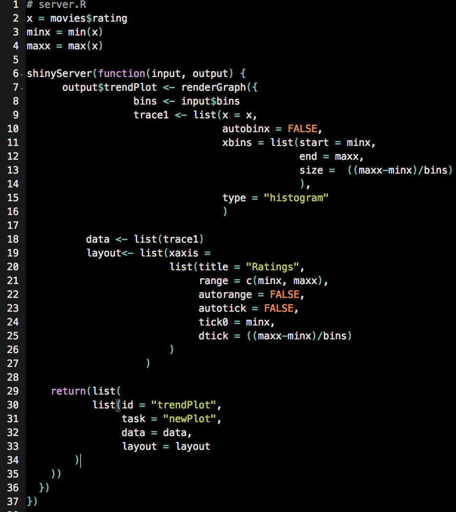
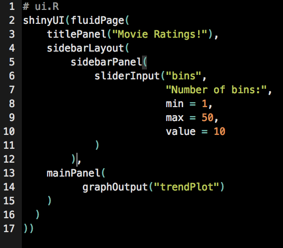
This simple example (based on Hello Shiny) uses Plotly syntax to create a histogram of movie ratings (from a ggplot/plotly built in data set) where the user can change the number of bins in the histogram. The scripts are available here. server.R contains the graph, written in Plotly syntax and ui.R consists of a title panel, a sidebar panel with the slider to select the number of bins, and a main panel that displays the graph.
UN Advanced:
Grab the scripts here or a simpler version here!
This example uses both ggplot and plotly syntax to create the shiny app. The structure of the server script is similar to the one in the example above with an added function: gg<-gg2list(YOUR_GGPLOT). After this point, you can use plotly syntax to make any additional edits then finally in the return set, data = gg$data and layout = gg$layout. This server.R script also includes the code to adjust the title of the graph based on the countries that are selected for the plot and the code to add colored text annotations to the end of each line in the graph.
Diamonds:
Grab the scripts here!
This example is adapted from a ggplot/shiny example and uses the built in diamonds dataset. The variables in the graph can be edited to view the data in different ways. In addition to graphing x and y variables, the user can also add an optional color variable, and create multiple plots in columns and/or rows.
Questions? Suggestions? Email feedback[at]plot[dot]ly, use StackOverflow, or tweet to @plotlygraphs.
Are you setting up a dashboard for your company? Consider contacting Plotly Enterprise for an On-Premise Plotly appliance or support services from our team. To create a new dashboard or to request a demo for our online dashboards in R, Python and MATLAB, visit the dashboards section of Plotly’s website. For more documentation on using RShiny, take a look at this tutorial.