These 6 visualizations were created in Plotly between 2014 and 2016 and are in some way related to machine learning. They were created using Plotly’s free and open-source graphing libraries for Python and R.
1. machine learning classifier comparison
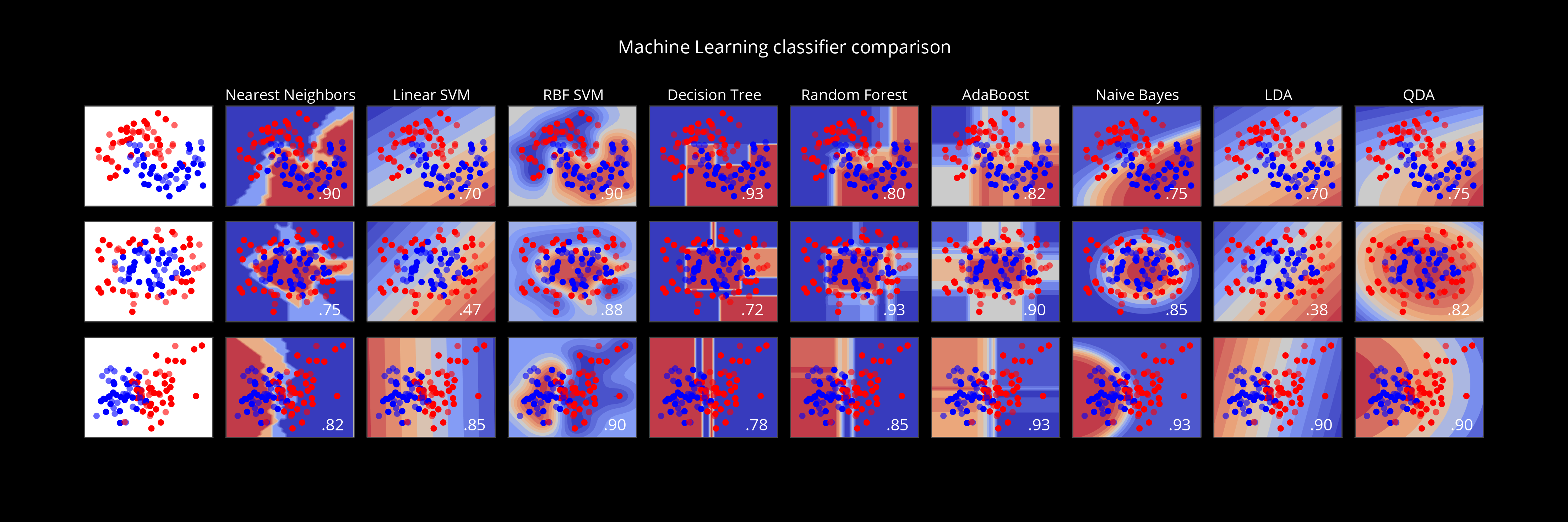
Made in Python by Étienne Tétreault-Pinard
2. COUNtRIES WHERE AI IS MOST RESEARCHED
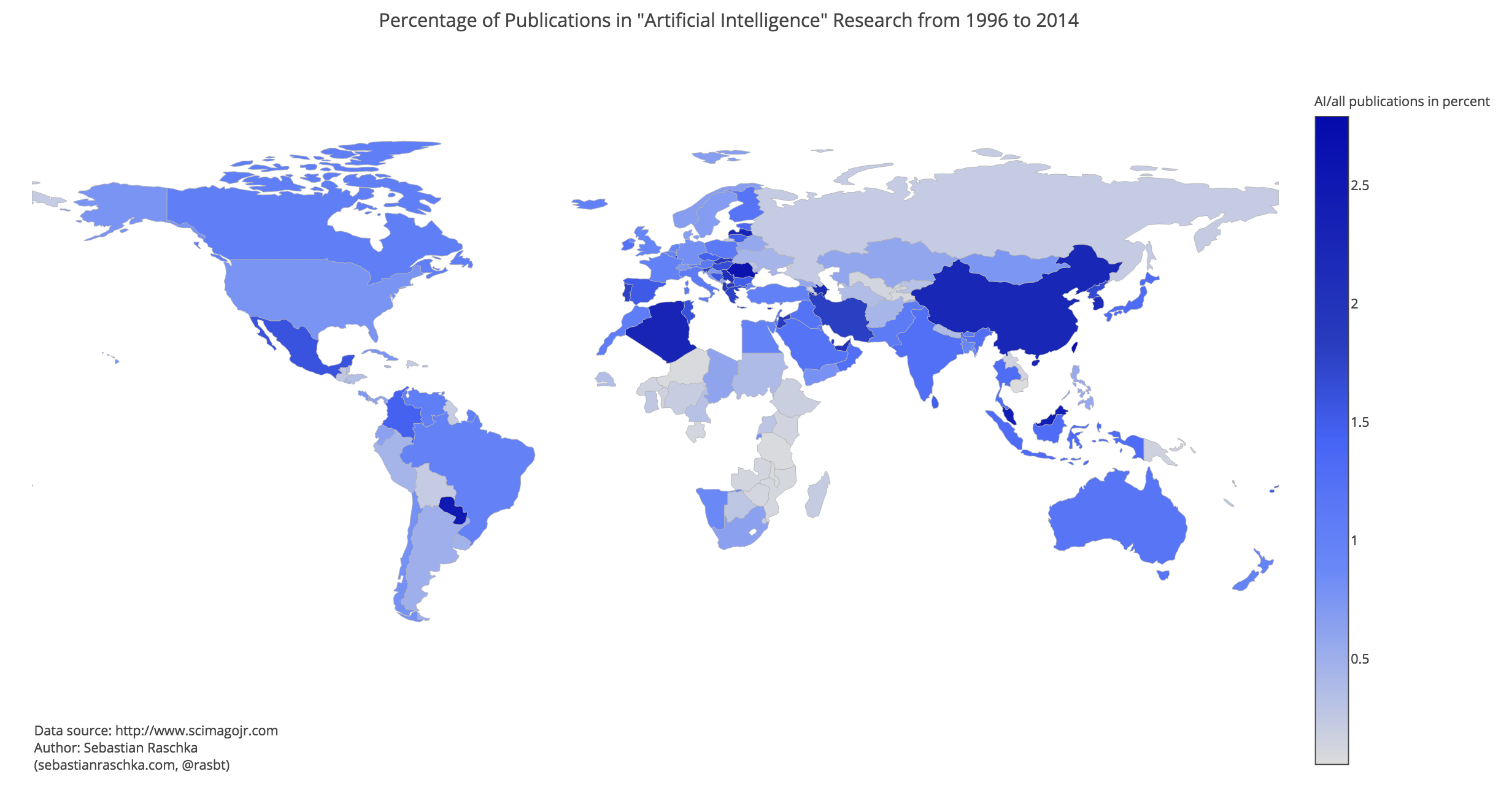
Made in Python by Sebastian Raschka
3. 3D K-MEANS CLUSTERING WITH CUSTOM HOVER TEXT
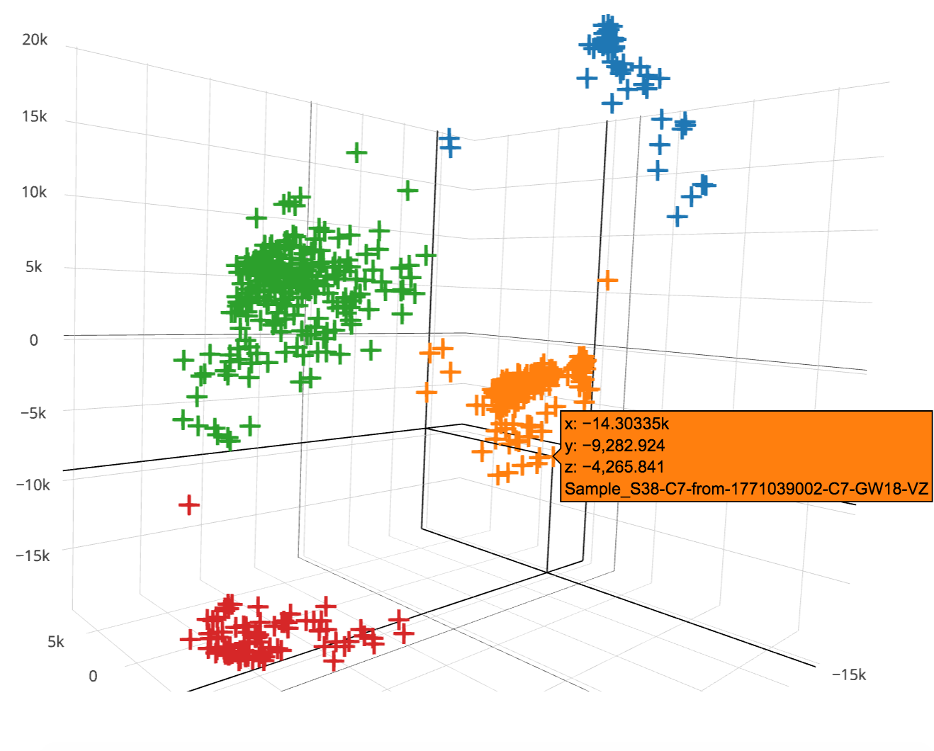
Made in Python by Smpl Bio
4. text machine learning comparison
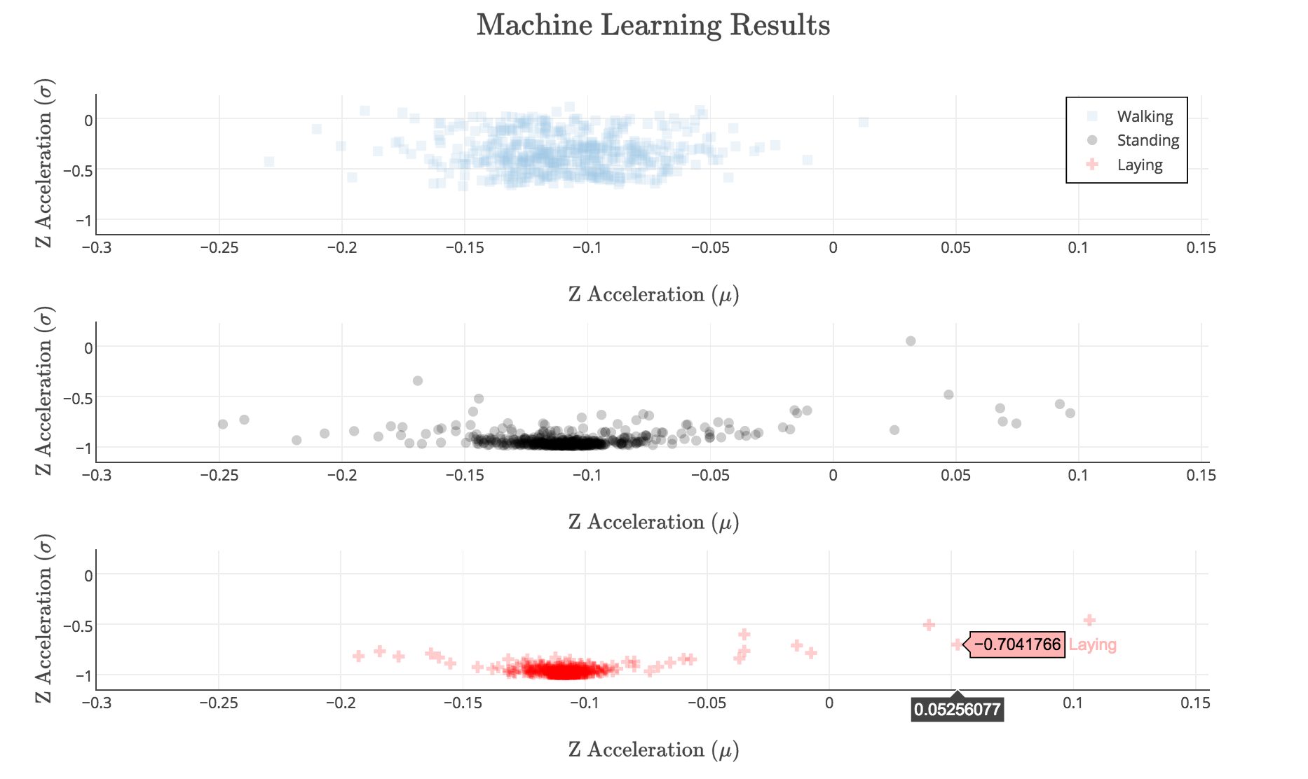
Made in Python by Plotly user damienrj
5. Decision tree with reingold-tilford layout
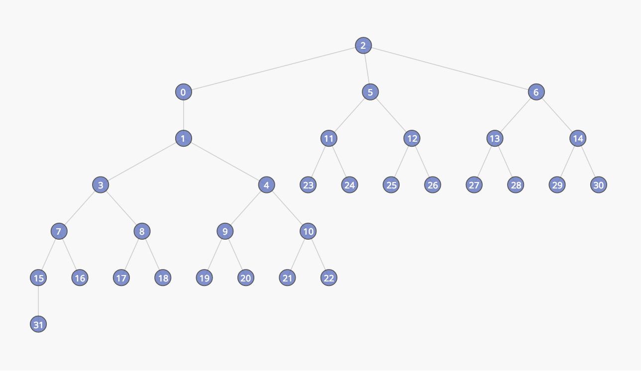
Made in Python by Emilia Petrisor
6. 2D K-MEANS CLUSTERING OF TWITTER DATA
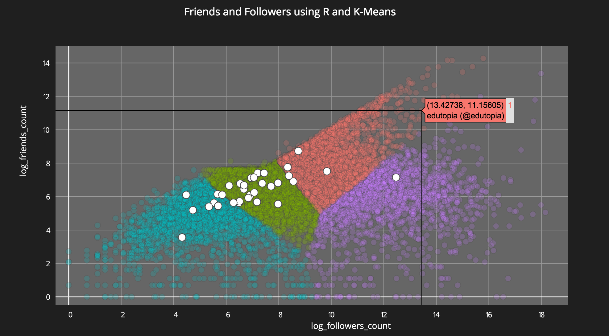
Made in R by Carson Sievert